The best kind of challenge for a UX project is to put yourself into another person’s very different pair of shoes
Vision Australia wants to improve their services for Audio Description (AD) at live performances for people with visual impairments. AD fills in the gaps for live or pre-recorded entertainment with a radio based device and headphone(s) receiving the audio of a describer who narrates the visual aspects of what’s going on. Currently, describers are unpaid volunteers working in pairs to present the two halves of a show and other hosting duties.
Through 1:1 interviews, an online survey and emails reaching out worldwide to audiences, theatres and production companies involved in AD, our team of three amassed a wealth of data that we synthesised to discover our major pain points to improve upon: the current equipment was unreliable and uncomfortable, an inconsistent experience and anxiety inducing state for those in the audience using it.
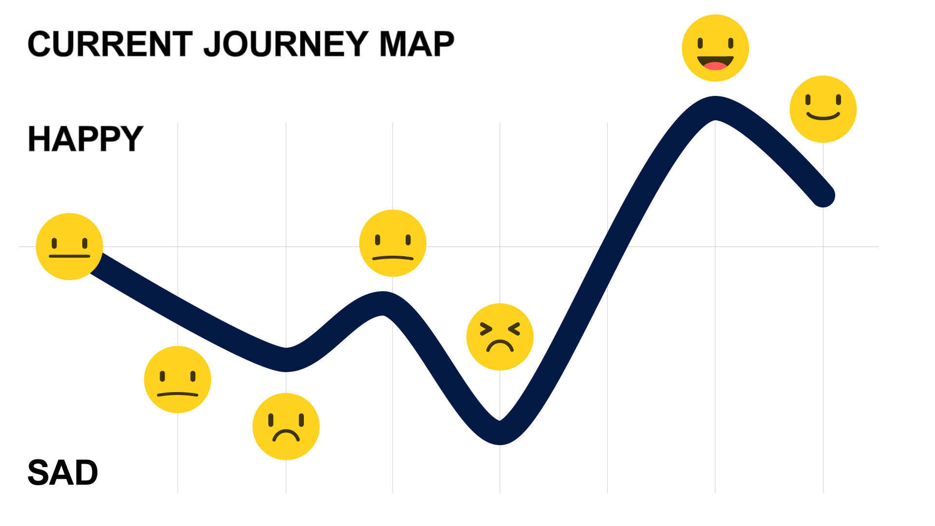
Our developed priority persona, Katherine, is a tech savvy theatre lover and has more than a liking for the accessibility options her iPhone affords her. We journey mapped the current experience (above), then our ideal experience (below), which eliminated the steps in the current process of loaning and returning the old radio-based AD equipment by allowing Katherine to use her familiar iPhone which in turn removed the frustrations experienced previously. Ultimately, a smart phone solution will also provide a more reliable means of broadcasting and receiving the AD through WiFi.
Our prototype was designed for different levels of visual impairment and familiarity with smart phones – an easy step by step process was planned that allows users to connect and access the AD for a show through large type and touch control, or through spoken prompts and voice commands, thanks to Adobe Xd’s unique features for interacting by speech. Two iterations were produced and tested, resulting in this final iteration (requires Adobe ID for spoken commands and responses):
Future steps would include:
How the interface could also work with screen readers, which drastically changes how people with visual impairments use smart phones.
Digital wallet integration could also automate much of the process of connecting to a WiFi network and choosing your show.
The audio description itself could be recorded and automatically played back at each live show, analysing sound and/or video to keep in sync with what’s happening on stage, potentially allowing for every live performance to provide AD services, as well as the possibility of choosing from different voices of describer.
Education of everyone who could benefit from or is involved in audio description would be an ongoing process.
It’s all just a flick of the wrist…
This was an unorthodox project in that every step of the UX process was handled solely by myself…for better or worse. Read on for the tale of how two (or more) heads is indeed better than one.
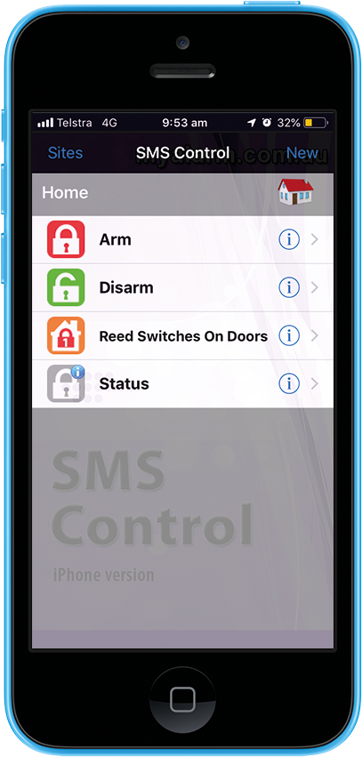
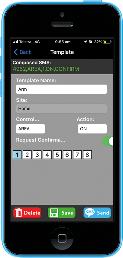
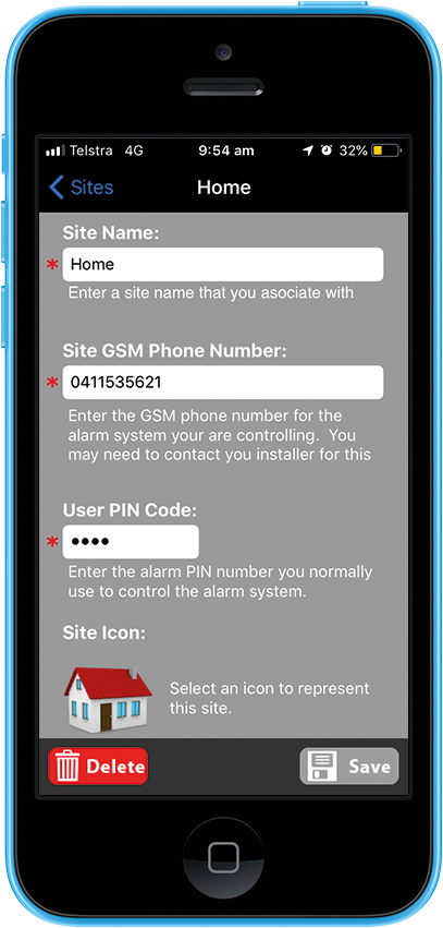
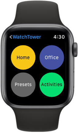
Originally, the project started with the intention of improving the experience of an existing home security smart phone app (SMS Control) with a pivot made to a smart watch app during the business analysis. The idea was to go broader and capture a different digital medium – the smart watch. A competitive analysis of home security apps for smart watches revealed that there are lots of free complimentary apps for specific branded hardware - but there was no single app communicating to multiple systems.
I interviewed 4 smart watch owners and 4 non-smart watch users about wearable devices, home security and remotely controlling other devices.
It turns out everyone was talking more about remotely controlling their smart lights or garage doors rather than home security, with an extensive wish list of what else they’d love to control – air conditioning, video surveillance, etc. Another major insight was that the workplace was also prime for remote control, with two interviewees managing locations for their businesses.
The pivot to a smart watch app was validated by users’ expression of extra convenience over smart phones to control devices when with children, in a meeting, driving or exercising. People hated traditional multiple control devices and would love to receive notifications to respond to.
The Problem Statement became: People want a way to remotely control their home and business devices from their smart watches to provide a quicker and more convenient experience than current smart phones or other means of control. To that end storyboards were devised to show how this app solution met all their needs and wants. Follow Chris, our primary persona, on a typical day that demonstrates how WatchTower is worth its weight in gold.
A site map was produced from a card sort that focused on grouping content likely required in the app. A user flow, very similar to the scenario in the storyboard, was then planned.
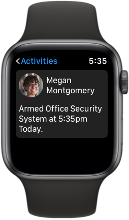
The Apple Watch was the chosen platform given its marketshare, which was reflected in the number of interviewees owning that model of smart watch. Apple’s Human Interface Guidelines (HIG) were referenced during visual ideation. A paper prototype was produced and tested with the user task outlined in the user flow. An A/B test was carried out on how to best move forward with the main menu navigation. Nothing beats the power of observing and taking on suggestions from users during testing and many improvements were made in the next iteration.
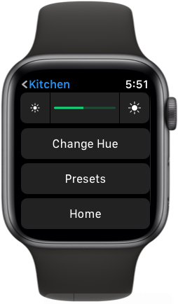
A second iteration was made digitally to a high fidelity interactive prototype. I felt that lower to medium fidelity prototypes wasn’t an efficient use of time given I planned to stick closely to Apple’s HIG, where UI conventions are in place to already ensure a great user experience – no UI ideation was required here. You can test the interactive prototype for yourself.
Next steps include:
implementation of reminder notifications based on device usage or time of day
to investigate ways of providing a more hierarchical navigation so it’s quicker to access features several layers deep within the site map
Include presets for your remote devices so users can quickly control them for regular tasks
This first iteration provides a solid foundation for fulfilling users needs to control their current and future smart devices as conveniently as possible.
There was a certain irony, as someone who follows Apple quite closely, that at the end of the two week sprint I had somehow forgotten about Apple’s own ‘Home’ app and ecosystem for remotely controlling devices. I thought: “DISASTER!” If I’d worked in a team, it’s likely someone else would have picked up on this oversight.
However, after dusting myself off, I could see that Apple’s ‘Home’ falls short in two major areas: it’s not inclusive of the controlling devices in the workplace and WatchTower could prove more popular as it could go cross platform to Samsung, Garmin and Fitbit as well as Apple’s marketshare leading devices.
The Benefits of Providing a Unified User Experience
Anytime Fitness has an existing app that works together with three other separate apps for tracking fitness. They want to consolidate the apps into a single experience to provide a more compelling solution to tracking fitness data.
Our team of three made these assumptions on the existing product: low functionality, no class scheduler, confusion between apps, and users might already be using a different app to track fitness and not want to lose past data.
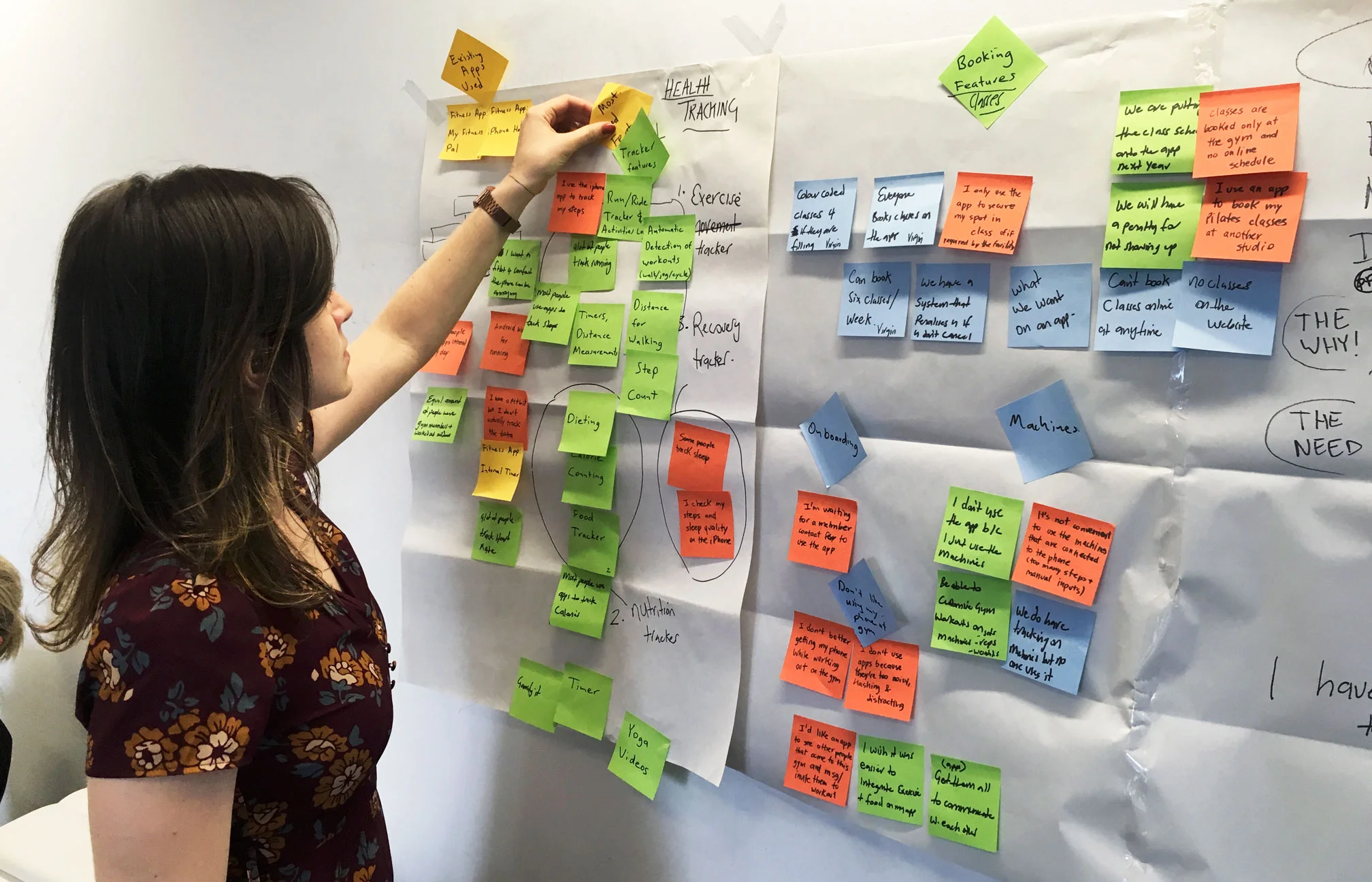
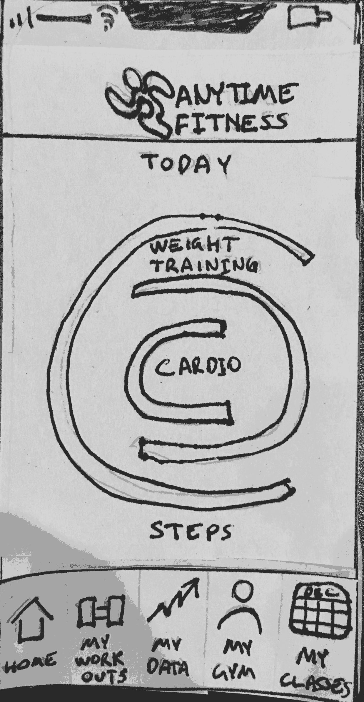
To gain research data, we interviewed current Anytime Fitness gym members about the current app configuration and how they track their exercise. Likewise, an online survey captured a good deal of quantatative data. Utilising both, an affinity map synthesised the data and revealed the following pain points:
• Most users have smart phones but were not finding a valuable experience to actually use the AnyTime Fitness app
• Trend in tracking health data and more specifically, users track different kinds of data using several apps
• Many users also exercise outdoors
• Users want to view and book classes online
From this we could create two typical personas embodying current AnyTime Fitness – Stephanie and Jon.
The problem statement was then derived: Anytime Fitness members need a way to track their health data all in one app so they have a convenient way to optimise their health.
How might we…
Present fitness data in a way that is easy to understand?
Make it a convenient experience?
Re-iterate the interface so that the user is only using one app?
Provide a way for the user to compile their health data in one place?
Engage users that are already tracking their fitness data?
A storyboard helps us to empathise with our primary persona, Jon.
Apart from developing a site map and user flow to inform the first paper prototype, a collaborative design studio was done where 5 minutes was given to sketch out each flow, which were compared and the best features of each were chosen to include in the paper prototype.
We tested for the following user task:
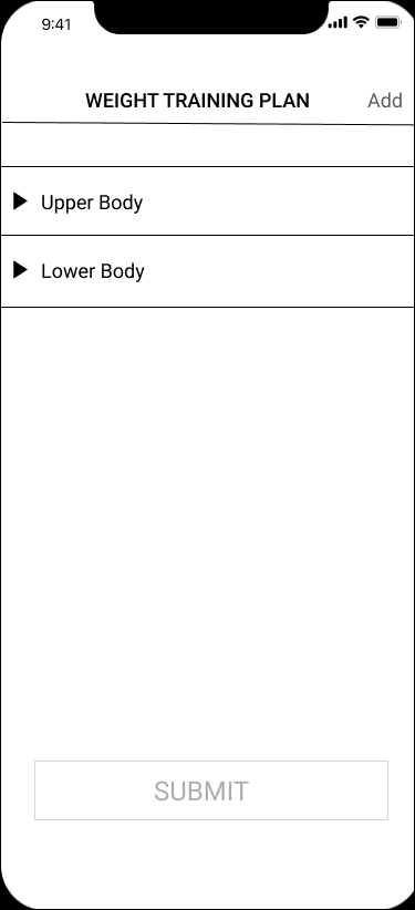
After working out, you need to log a different weight than what was on your pre-programmed plan for ‘Lower Body’ workout
Update ‘Leg Press’ with 55kg weight
View a summary of today’s fitness data with the now updated workout
A second medium fidelity iteration was made, taking account of the observations and feedback we received from the paper prototype.
Through more user testing, we arrived upon our final high fidelity prototype iteration.
Next Steps for the project
Develop feature to book classes
Integrate data from other fitness related apps so the user can see their holistic progress
Develop visual summary of data to be even more meaningful to users
Encourage independently exercising non-Anytime Fitness members to try the App
As it stands after this sprint, the new consolidated Anytime Fitness app has meets presenting a single unified experience and presenting data in a more meaningful way that will ensure users will track their fitness more regularly when going to the gym or exercising independently.
Motion Graphics Married With User Interface
Previously, I worked as a graphic designer creating packaging, interactive design and motion graphics for DVD and Blu-ray products for Madman Entertainment.
Having released Lion Force Voltron and Vehicle Force Voltron as individual premium collectable packages, a "Best Of" collection was also released with fans voting for which episodes to include. This DVD animated build includes all the characters and colour schemes matching the five separate releases for Lion Force Voltron on DVD. Madman Entertainment was first worldwide to release Voltron on DVD. Created using Adobe After Effects, Photoshop and Illustrator.
Animated build menu for the anime series Geneshaft, released on DVD by Madman Entertainment for the Australian and New Zealand market. Created using Adobe After Effects, Photoshop and Illustrator.
Animated build menu for Ranma 1/2 Series 1, released on DVD in 2006 by Madman Entertainment for the Australian and New Zealand market. Created in Adobe After Effects, Photoshop and Illustrator.
Animated build menu for Argentosoma anime series, released on DVD in 2003 by for the Australian and New Zealand market. Created by myself using Adobe After Effects, Photoshop and Painter and sound effects digitally recording a radio going between frequencies.
The seminal anime series Macross was released uncut and in its original Japanese by Madman Entertainment in 2004 for the Australian and New Zealand markets. Created by myself using Adobe After Effects, Photoshop and Illustrator.


